
Assign Services to a Customer
Designing for efficiency without compromising operational safety
How I redesigned a complex enterprise banking workflow by balancing user research, usability, technical constraints, and operational risk.
As part of a broader Back-Office modernization initiative, I led the UX process for redesigning how internal banking employees assign and configure services for corporate customers.
The existing Classic experience exposed approximately 40 services and their configuration settings on a single long page. Although this gave experienced employees access to important information, the interface made it difficult to identify assigned services, locate specific configurations, and compare settings efficiently.
The challenge was to create a more structured and accessible experience without introducing operational risks into a business-critical workflow.
02. The problem
When visibility comes at the cost of clarity
The legacy experience presented all available services and settings together, with employees assigning services directly through checkboxes.
This approach offered one important benefit: employees could see existing settings while configuring additional services.
However, usability observations revealed several problems.
Overwhelming information density
Approximately 40 services and their settings appeared on one page, with no compact, scannable overview.
Poor status visibility
Employees couldn’t easily distinguish assigned from unassigned services, increasing the need to inspect individual configurations.
Inefficient discovery and comparison
Excessive scrolling and the absence of filtering, sorting, or search made locating services difficult. Comparing configurations required substantial mental effort.
Operational risk and uncertainty
Employees were concerned about missing settings or losing entitlements, encouraging cautious, slower interactions.
The design challenge
HOW MIGHT WE
Support one-service-at-a-time assignment in a way that feels fast and efficient, while giving bankers a clear, compact view of services, their status, and settings – so they can confidently review, compare, and assign services with minimal risk?
This reframed the problem. The goal wasn’t just to reduce scrolling or clicks. It was to improve the employee’s ability to make accurate configuration decisions while preserving the reliability of the underlying system.
03. Discovery and research
Understanding the workflow before redesigning the interface
I approached the problem within the broader Back-Office modernization initiative, examining how customer information, accounts, services, and entitlements connect throughout the customer setup journey.
My research and design exploration focused on understanding what employees needed to see, how they compared configurations, and where the legacy experience created friction.
The research findings highlighted an important tension: employees wanted a cleaner interface, but they also valued being able to review multiple service settings without navigating between disconnected views.
Key feedback captured in the design critique included requests for alphabetical ordering, clearer assigned/unassigned terminology, bulk service assignment, and visibility into related account and user counts.
These findings informed three successive design directions.
04. Design exploration
Three iterations. One critical product decision.
Iteration 1
Table + Drawer
IMPROVING STRUCTURE AND SCANNABILITY
My first redesign replaced the overwhelming legacy layout with a structured service table and contextual drawer.
The table created a clearer overview, while the drawer separated configuration details from the main service list.
What improved: Information organization and visibility.
What we learned: Employees needed to repeatedly open and close drawers to review or compare service settings. The cleaner layout introduced additional interactions and interrupted their workflow.
The solution reduced visual complexity but made cross-service comparison more fragmented.
Iteration 2
Bulk Selection + Assignment Page
EXPLORING A FASTER WORKFLOW
In the second iteration, I explored allowing employees to select multiple services and review their configurations together on a dedicated assignment page.
Usability feedback was very positive. Employees perceived the approach as faster, more efficient, and better suited to comparing service settings.
But we uncovered a critical constraint.
The existing Classic system had experienced entitlement loss associated with bulk service assignment and performance issues.
Even though employees preferred this approach, introducing a similar interaction into the modern experience would carry unacceptable operational risk.
The decision: We ruled out bulk assignment despite the positive usability feedback.
Iteration 3
Accordion + Persistent Side Panel
BALANCING EFFICIENCY WITH SYSTEM RELIABILITY
I recommended a third direction that preserved the safer one-service-at-a-time assignment model while addressing the usability limitations of the earlier concepts.
The solution combined an accordion-based service list with a persistent right-side configuration panel.
This allowed employees to navigate between services while keeping settings visible, reducing the repeated opening and closing of drawers.
It also preserved a more compact overview of available services and provided a clearer relationship between the selected service and its configuration.
The design direction balanced employee needs, interaction efficiency, technical feasibility, and entitlement risk.
05. The key design decision
The second iteration created a meaningful decision point. Positive usability feedback alone was not enough to justify moving forward.
I needed to evaluate the experience within the constraints of a financial system where incorrect service entitlements could create downstream operational consequences.
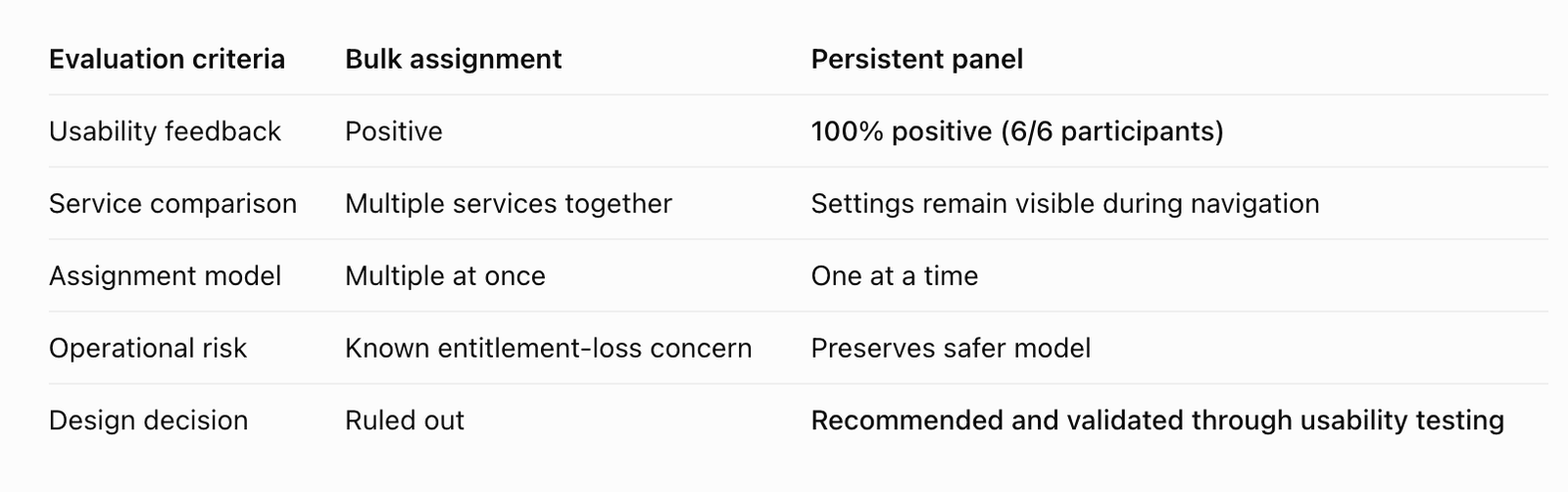
The decision was not to sacrifice usability for technical limitations. It was to find a design that addressed the underlying user need – efficiently reviewing and comparing service settings—without depending on a risky bulk operation.
This became the defining principle of the solution:
Preserve the context employees need, without introducing the operational risk the system cannot safely support.
06. Final design direction
A more contextual, structured service management experience
The final recommended design uses two complementary interaction patterns
Accordion-based service navigation
Organizes services into a more compact, manageable structure, allowing employees to focus on relevant information rather than scanning a long page of settings.
Persistent configuration panel
Keeps configuration information visible while employees move between services, supporting comparison and reducing unnecessary interactions.
Controlled service assignment
Maintains the safer one-service-at-a-time approach rather than introducing bulk operations associated with known entitlement risks.
Lorem ipsum dolor sit amet, consectetur adipiscing elit. Ut elit tellus, luctus nec ullamcorper mattis, pulvinar dapibus leo.

